Analyse the mobility situation: Difference between revisions
No edit summary |
No edit summary |
||
| (8 intermediate revisions by the same user not shown) | |||
| Line 1: | Line 1: | ||
{{SumpStep/top|step=3|phase=1|title=Analyse the mobility situation}}<div class="sump-intro"> | {{SumpStep/top|step=3|phase=1|title=Analyse the mobility situation}}<div class="sump-intro"> | ||
With the working structures in place and the planning framework set, Step 3 is where the plan finally meets reality. It builds the evidence base the rest of the SUMP will stand on: how people actually move today, where access to everyday life falls short, who is most affected by those gaps, and what the genuine opportunities are. Just as importantly, it fixes the baseline, the measured starting point against which the finished plan will later be judged. A plan is only ever as good as the diagnosis underneath it, and a weak or borrowed diagnosis produces a weak or borrowed plan. | With the working structures in place and the planning framework set, Step 3 is where the plan finally meets reality. It builds the evidence base the rest of the SUMP will stand on: how people actually move today, where access to everyday life falls short, who is most affected by those gaps, and what the genuine opportunities are. Just as importantly, it fixes the baseline, the measured starting point against which the finished plan will later be judged. A plan is only ever as good as the diagnosis underneath it, and a weak or borrowed diagnosis produces a weak or borrowed plan. | ||
</div> | |||
<div class="sump-prereq"> | |||
<div class="sump-prereq__title">Before you start this step you should already have</div> | |||
<div class="sump-prereq__list"> | |||
<div class="sump-prereq__item"><div class="sump-prereq__box"></div><div class="sump-prereq__text">The [[Determine the planning framework|functional boundary of your area]] written down, so you know which settlements and which edges the analysis has to cover.</div></div> | |||
<div class="sump-prereq__item"><div class="sump-prereq__box"></div><div class="sump-prereq__text">The population groups you decided to plan for, because the perceived side of the analysis is only meaningful once you know whose proximity you are measuring.</div></div> | |||
<div class="sump-prereq__item"><div class="sump-prereq__box"></div><div class="sump-prereq__text">Agreement from the [[Set up working structures|bodies that hold the data]], including any neighbouring municipality or transport authority whose figures you will need and cannot compel.</div></div> | |||
</div> | |||
</div> | </div> | ||
| Line 15: | Line 24: | ||
<div class="sump-versus"> | <div class="sump-versus"> | ||
<div class="sump-versus__pane"> | <div class="sump-versus__pane"> | ||
<div class="sump-versus__fig">[[File:DREAMS-accessibility-normative-view.svg|frameless|800px|link=|alt=An eye looking at a row of amenities along a direct dashed route.]]</div> | |||
<div class="sump-versus__head">The normative view</div> | <div class="sump-versus__head">The normative view</div> | ||
Every amenity counts equally, and reaching just one of each within a 15-minute walk is enough. This is what an abstract textbook standard says about your area. | Every amenity counts equally, and reaching just one of each within a 15-minute walk is enough. This is what an abstract textbook standard says about your area. | ||
</div> | </div> | ||
<div class="sump-versus__pane sump-versus__pane--accent"> | <div class="sump-versus__pane sump-versus__pane--accent"> | ||
<div class="sump-versus__fig">[[File:DREAMS-accessibility-perceived-view.svg|frameless|800px|link=|alt=The same amenities seen with a park, traffic and a longer route between them.]]</div> | |||
<div class="sump-versus__head">The perceived view</div> | <div class="sump-versus__head">The perceived view</div> | ||
The weights, the number of each amenity people want nearby, and the walking times they will genuinely accept, all drawn from the DREAMS resident survey across the six living labs. This is whether residents would actually experience the area as well served. | The weights, the number of each amenity people want nearby, and the walking times they will genuinely accept, all drawn from the DREAMS resident survey across the six living labs. This is whether residents would actually experience the area as well served. | ||
| Line 27: | Line 38: | ||
<div class="dreams-figures"> | <div class="dreams-figures"> | ||
<div class="dreams-figure"><div class="dreams-figure__value">6 of 6</div><div class="dreams-figure__label">living labs scored lower once accessibility was measured with residents' own priorities instead of the textbook standard.</div></div> | <div class="dreams-figure"><div class="dreams-figure__value">6 of 6</div><div class="dreams-figure__label">living labs scored lower once accessibility was measured with residents' own priorities instead of the textbook standard.</div></div> | ||
<div class="dreams-figure"><div class="dreams-figure__value">21 points</div><div class="dreams-figure__label">the average fall in | <div class="dreams-figure"><div class="dreams-figure__value">21 points</div><div class="dreams-figure__label">is the average fall in measured accessibility across the six labs, on a scale where 100 means every everyday amenity is within reach.</div></div> | ||
<div class="dreams-figure"><div class="dreams-figure__value">2 to 3</div><div class="dreams-figure__label"> | <div class="dreams-figure"><div class="dreams-figure__value">2 to 3</div><div class="dreams-figure__label">is how many of each amenity most residents want nearby. The textbook standard asks for one.</div></div> | ||
</div> | </div> | ||
== What the living labs revealed == | == What the living labs revealed == | ||
| Line 37: | Line 46: | ||
Measured against the textbook standard, the six labs looked reasonably healthy. On paper each came out as a passable 15-minute neighbourhood, a place where residents could already reach most of the everyday amenities they need within a short walk. | Measured against the textbook standard, the six labs looked reasonably healthy. On paper each came out as a passable 15-minute neighbourhood, a place where residents could already reach most of the everyday amenities they need within a short walk. | ||
That impression did not stand with what residents actually want. Once the analysis used their real priorities, gathered by a survey in each living lab neighbourhood, measured accessibility fell in every single one of the labs. The survey contained questions like how many of each amenity they need nearby and how long they would deem an acceptable walk for it. How far the measured accessibility fell depended entirely on who you were planning for. For young adults in Évry-Courcouronnes the change was slight, because the area already gave them alternatives for the things they cared about. But the groups with the least flexibility fared badly | That impression did not stand with what residents actually want. Once the analysis used their real priorities, gathered by a survey in each living lab neighbourhood, measured accessibility fell in every single one of the labs. The survey contained questions like how many of each amenity they need nearby and how long they would deem an acceptable walk for it. How far the measured accessibility fell depended entirely on who you were planning for. For young adults in Évry-Courcouronnes the change was slight, because the area already gave them alternatives for the things they cared about. But the groups with the least flexibility fared badly for parents in Brussels, older residents in Geretsried, working-age adults in Budapest and low-income households in Utrecht, much of that apparent access turned out to be unusable in practice, and their real proximity was far worse than the textbook picture suggested. | ||
One everyday destination drove the gap almost everywhere | One everyday destination drove the gap almost everywhere. Groceries, the most frequent trip in most households, was consistently the hardest amenity to reach on foot. That is the concrete counterpart to the benchmarking finding that suburban residents are most car-dependent precisely for their shopping trips. | ||
DREAMS also looked beneath the averages. A persona analysis of the survey data ([[Publications/8|Deliverable 4.2]]) found that accessibility needs do not map neatly onto age or income. Some profiles, such as families with children or older people ageing in place, follow | DREAMS also looked beneath the averages. A persona analysis of the survey data ([[Publications/8|Deliverable 4.2]]) found that accessibility needs do not map neatly onto age or income. Some profiles, such as families with children or older people ageing in place, follow clefar life-course logics, while others, built around daily convenience or social life, cut straight across demographic lines and coexist within the same neighbourhood. The behavioural choice experiments reinforced the point. Public transport remained the most stable and attractive option everywhere, with shared and micromobility services working as complements rather than universal substitutes, their usefulness depending heavily on trip purpose and local context. | ||
These findings translate into three rules for diagnosing your own neighbourhood, and they shape every later step of the SUMP: | These findings translate into three rules for diagnosing your own neighbourhood, and they shape every later step of the SUMP: | ||
| Line 63: | Line 72: | ||
== Analysing your own neighbourhood == | == Analysing your own neighbourhood == | ||
The sequence for this step is the same whether you use the DREAMS tools or your own data. Start by assembling what already exists | The sequence for this step is the same whether you use the DREAMS tools or your own data. Start by assembling what already exists, meaning household travel surveys, census and land-use data, public transport service data, and an OpenStreetMap-based amenity inventory. Map your area's normative accessibility to see where the obvious cold spots are. Then gather the perceived side through a resident survey, so you learn not just what is reachable but what residents need, how many of each amenity they want, and how far they will really walk. Compare the two, break the results down by the population groups you are planning for, and write the findings up as an explicit, dated baseline. Resist the temptation to analyse everything at once. A focused diagnosis of the trips and groups that matter most will serve the plan far better than an exhaustive one that no one finishes. | ||
<div class="dreams-callout">'''Measure the gap, not just the map.''' The normative accessibility map will flatter your area. The number that should drive your plan is the '''difference''' between what a textbook 15-minute standard rewards and what residents actually experience and, underneath it, which trips still force people into a car.</div> | <div class="dreams-callout">'''Measure the gap, not just the map.''' The normative accessibility map will flatter your area. The number that should drive your plan is the '''difference''' between what a textbook 15-minute standard rewards and what residents actually experience and, underneath it, which trips still force people into a car.</div> | ||
| Line 73: | Line 82: | ||
</div> | </div> | ||
<div class="sump-sources">Sources | <div class="sump-sources"> | ||
<div class="sump-sources__title">Sources and further information</div> | |||
<div class="sump-sources__item"><span class="sump-sources__ref">EU SUMP Guidelines, Second Edition</span> (Rupprecht Consult, 2019), Step 3, Analyse mobility situation.</div> | |||
<div class="sump-sources__item"><span class="sump-sources__ref">[[Publications/4|DREAMS Deliverable 2.3]]</span>: benchmarking travel and activity location choice behaviour across the study locations.</div> | |||
<div class="sump-sources__item"><span class="sump-sources__ref">[[Publications/7|DREAMS Deliverable 3.1]]</span>: the DREAMS accessibility modelling framework and the compliance figures behind the gap.</div> | |||
<div class="sump-sources__item"><span class="sump-sources__ref">[[Publications/8|DREAMS Deliverable 4.2]]</span>: resident preference and persona data on perceived accessibility.</div> | |||
</div> | |||
{{SumpStep/bottom|step=3}} | {{SumpStep/bottom|step=3}} | ||
Latest revision as of 12:42, 31 August 2026
Step 3 of 12 Preparation & Analysis
With the working structures in place and the planning framework set, Step 3 is where the plan finally meets reality. It builds the evidence base the rest of the SUMP will stand on: how people actually move today, where access to everyday life falls short, who is most affected by those gaps, and what the genuine opportunities are. Just as importantly, it fixes the baseline, the measured starting point against which the finished plan will later be judged. A plan is only ever as good as the diagnosis underneath it, and a weak or borrowed diagnosis produces a weak or borrowed plan.
What standard analysis misses in the periphery
Conventional mobility analysis is tuned to the dense city core, where the headline problem is congestion and the natural metrics are traffic volumes, journey speeds and modal split at the cordon. Carried unchanged into the outskirts, that lens measures the wrong thing. In low- and mid-density peripheries the real issue is not that movement is slow but that so much of daily life can only be reached by car at all: whether a resident can get to groceries, a doctor, a school or a green space on foot, by bike or by public transport. DREAMS reframes the analysis around proximity and accessibility rather than traffic flow, and that shift changes both what you measure and what you count as a problem in the first place.
The DREAMS benchmarking work (Deliverable 2.3) shows why this matters empirically. Drawing on national household travel surveys across the six study regions, it found that accessibility in the outskirts is generally worse than in the urban core. Budapest's periphery had the lowest accessibility for both work and shopping trips, while Munich was the notable exception, with work, shopping and leisure access actually improving in its suburbs. Above all, the analysis found a high degree of car dependency for everyday trips in the suburbs, and especially for shopping, which is exactly the kind of routine, frequent journey a 15-minute neighbourhood is meant to bring within reach. Diagnosing that car-dependency honestly, trip purpose by trip purpose, is the work of this step.
How DREAMS measures accessibility
The platform's DREAMS Accessibility Tool (DAT) gives practitioners a way to map this directly. Rather than counting cars, it asks of every location a simpler question: what share of the amenities people actually care about, groceries, pharmacies, schools, cafés, parks and the rest, can be reached within an acceptable walk? It answers that question two ways.
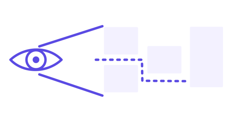
Every amenity counts equally, and reaching just one of each within a 15-minute walk is enough. This is what an abstract textbook standard says about your area.
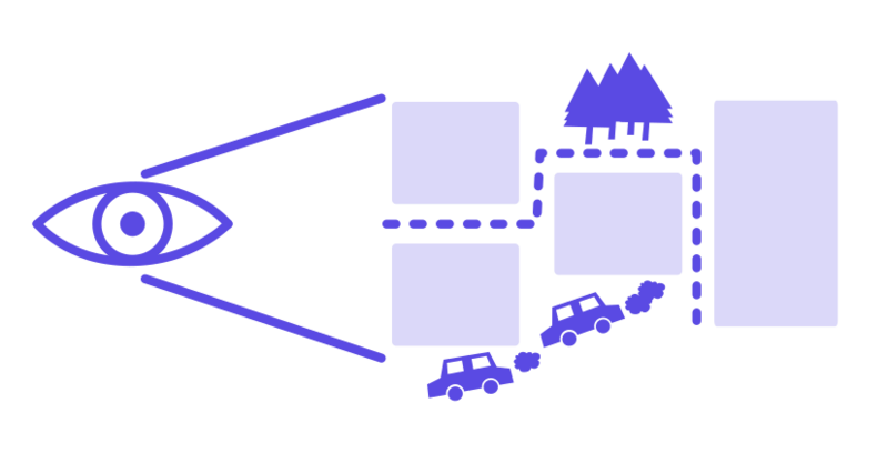
The weights, the number of each amenity people want nearby, and the walking times they will genuinely accept, all drawn from the DREAMS resident survey across the six living labs. This is whether residents would actually experience the area as well served.
The two rarely agree, and the gap between them is the insight this step produces.
What the living labs revealed
Measured against the textbook standard, the six labs looked reasonably healthy. On paper each came out as a passable 15-minute neighbourhood, a place where residents could already reach most of the everyday amenities they need within a short walk.
That impression did not stand with what residents actually want. Once the analysis used their real priorities, gathered by a survey in each living lab neighbourhood, measured accessibility fell in every single one of the labs. The survey contained questions like how many of each amenity they need nearby and how long they would deem an acceptable walk for it. How far the measured accessibility fell depended entirely on who you were planning for. For young adults in Évry-Courcouronnes the change was slight, because the area already gave them alternatives for the things they cared about. But the groups with the least flexibility fared badly for parents in Brussels, older residents in Geretsried, working-age adults in Budapest and low-income households in Utrecht, much of that apparent access turned out to be unusable in practice, and their real proximity was far worse than the textbook picture suggested.
One everyday destination drove the gap almost everywhere. Groceries, the most frequent trip in most households, was consistently the hardest amenity to reach on foot. That is the concrete counterpart to the benchmarking finding that suburban residents are most car-dependent precisely for their shopping trips.
DREAMS also looked beneath the averages. A persona analysis of the survey data (Deliverable 4.2) found that accessibility needs do not map neatly onto age or income. Some profiles, such as families with children or older people ageing in place, follow clefar life-course logics, while others, built around daily convenience or social life, cut straight across demographic lines and coexist within the same neighbourhood. The behavioural choice experiments reinforced the point. Public transport remained the most stable and attractive option everywhere, with shared and micromobility services working as complements rather than universal substitutes, their usefulness depending heavily on trip purpose and local context.
These findings translate into three rules for diagnosing your own neighbourhood, and they shape every later step of the SUMP:
Analysing your own neighbourhood
The sequence for this step is the same whether you use the DREAMS tools or your own data. Start by assembling what already exists, meaning household travel surveys, census and land-use data, public transport service data, and an OpenStreetMap-based amenity inventory. Map your area's normative accessibility to see where the obvious cold spots are. Then gather the perceived side through a resident survey, so you learn not just what is reachable but what residents need, how many of each amenity they want, and how far they will really walk. Compare the two, break the results down by the population groups you are planning for, and write the findings up as an explicit, dated baseline. Resist the temptation to analyse everything at once. A focused diagnosis of the trips and groups that matter most will serve the plan far better than an exhaustive one that no one finishes.
The idea that perceived accessibility differs from the calculated kind is shared by the sister DUT project AccessCity4All, which combines accessibility modelling with walk-along interviews and participatory mapping across neighbourhoods from central to outskirt, a useful complement to the DREAMS survey-based approach. For practical guidance on gathering the data, especially on walking and cycling, see Module 3: Data for active modes (Baltic Sea Region Competence Centre on SUMP).